Previous Next
8.4 Layout Menu
Layers
The Layers menu item will open the Layers Tab, which is located in the lower Side bar on the lower right of the screen.
The Layers Tab is used to control the attributes of different layers.
Layering allows objects to be controlled in the following ways:
-
Shown or hidden from view
-
Editable or not editable
-
Printable or not printable
All objects in a layout are automatically assigned to a Layer. By definition, all the items in a Layer have the same status with regard to the four possibilities indicated. Changes in each Layer can be made by clicking on any of the four icons shown below for view, print, and/or edit.
View Icon image\ebx_-136862951.gif
Print Icon image\ebx_-1457806870.gif
Edit Icon image\ebx_352476167.gif
If the View icon is grayed out, it means all items in the selected Layer are not visible and they cannot be selected or modified in any way.
If the Print icon is grayed out, it means all items in the selected Layer cannot be printed.
If the Edit icon is grayed out, it means all items in the selected Layer are visible but they cannot be selected or modified in any way.
All the individual objects in each Layer are listed in the Layer dialog box. If the item is colored, it is displayed in its color.
When an LED layout is created, several layers are created as well. These layers, in addition to being visible or not in the layout, can also be exported or not in the Export dialog box. Note that a layer not being displayed in the layout does not mean that it will not be included in an export.
Guides commands
The commands in the Guides menu are used to create guidelines that perfectly match of the boundaries of an object. Instead of creating a guideline by dragging it from the Ruler and matching it to an object, use one the options below for speed and precision.
The six commands in the Guides submenu are as follows:
 Add Guide at Text Cap Height
 Add Guide at Text Baseline
 Add Guideline at Text Vertical Center
 Add Guide at Horizontal Center
 Add Guide at Vertical Center
 Add Guide Along Top Edge
 Add Guide Along Bottom Edge
 Add Guide Along Left Edge
 Add Guide Along Right Edge
This example has guidelines on all sides.
Shapes commands
The Shapes menu lists the available geometric shapes that you can draw in the layout. When you pick one, the cursor changes to indicate which kind of shape you will create. Simply press and hold down the left mouse button, while dragging the mouse so that the desired shape is created.
You can then manipulate this shape just like text or logos, using the graphical control points or the numberic values. However, there is one minor difference: You cannot simply click anywhere in the boundary of the shape, to select you must click one of the lines or arcs to select this shape for further manipulation.
The available Shape tools are as follows:
The first four are simple and create the expected shape:
 Rectangle
 Square
 Circle
 Ellipse
These three have additional features and their own property bar:
Note: Use Alt when dragging a rectangle to force modal mode and keep the tool active after creating a rectangle, if the modal tool option is not enabled in Options, Tools.
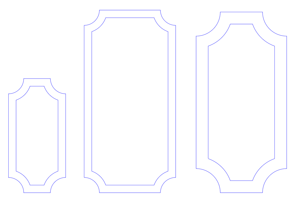
Rounded Rectangle
The Rounded Rectangle command allows you to create a symmetrical rounded rectangle with a specified width, height, corner radius and inline(s). This can be used to create standard cabinets.
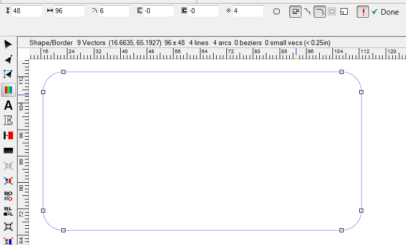
The property bar contains the following items, going left to right:
{{icon_height.png|Height|h5}}
Height
Enter the height of the rounded rectangle.
Width
Enter the width of the rounded rectangle.
Radius
Enter the radius of the corners. This number can be negative; in which case you get a notch.
First Inline
Enter the amount of inline you want applied to the rectangle.
Second Inline
Enter the amount of a second inline you want applied to the rectangle.
Number of Sides
This defaults to 4, but you can change this if you decide you want a different shape. See Polygon
Convert to Static Graphic
If you do not want the ability to edit the Rounded Rectangle using the above options, cllick on the Convert to Static Graphic button.
Alter Aspect Ratio
When Alter Aspect ratio is selected (highlighted, or pressed down), then you can change the Height and Width independently. When this is not selected, then any change to the Height or Width will automatically change the other dimension to maintain the same aspect ratio.
Notched Corners vs. Rounded Corners
One of these must be selected. The default is rounded corners.
Create Separate Objects
Scaled
This is an option that determines how a Rounded Rectangle with one or more Inlines is scaled. If the Scaled button is not pressed, then the inline amount will stay consistent as the shape is scaled. If the Scaled button is pressed, then it will scale proportionately, meaning that the inline amount(s) will change.
Auto Apply
The red exclamation point icon, when pressed, lets you see the changes to your Rounded Rectangle in real time.
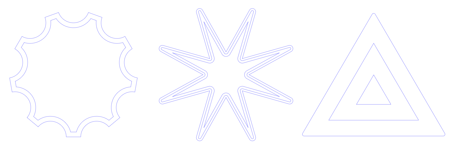
Polygon
The Polygon tool allows you to create a polygon with any number of sides, such as a pentagon (5 sided) or octagon (8 sided). When you select this command, the program initially creates a pentagon, and then a property box appears so that you can fine tune the parameters using the property bar.
The Polygon property bar is similar to the Rounded Rectangle property bar, but Polygons also let you create Star shapes by dragging the handles that appear in the middle of each side. Here is a sequence with one change at a time:
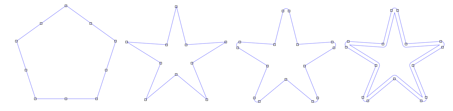
Holding the CTRL key is you select and drag the midpoints of each side keep the star symmetrical.
Here are some additional examples:
One final note on both Polygons and Rounded Rectangles: normally when you double click on a vector object, it launches PowerFlow, but in the case of these dynamic shapes, it will open the property bar and let you edit the parameters.
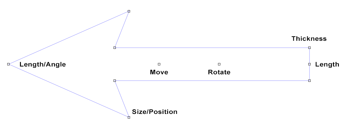
Arrow
The Arrow Tool is a quick and easy way to create and edit arrows. Simply drag each node until the arrow has the shape you want.
Click and drag to create an arrow, and note that you can rotate as well during the initial drawing. Once the Arrow is drawn, you'll see various points, and these are used to edit the arrow. All adjustments are symmetrical.
The property bar just has two options:
Constrain
Check this box when you want to only change the width of the arrow and not the length.
Default Shape
Click this to save the current shape as the default shape for new arrows.
Shift Options
Use Shift when moving the arrow tip and you will be adjusting the length of the shaft only.
Rotating
To rotate the arrow, drag the handle inside the shaft that's closer to the base of the arrow. Hold down Ctrl to snap to 0, 90, 180 and 270 degrees of rotation.
Note: Use Alt when dragging a rectangle to force modal mode and keep the tool active after creating an arrow, if the modal tool option is not enabled in Options, Tools.
Layout Properties
The Layout Properties property bar shows basic layout information and lets you make some changes.

 Height and Width
 Grid
Grid
 Default Layout
 Show Grid
 Snap to Grid
 Show Guidelines
 Snap to Guidelines
 Lock Layout
Size to Fit
This command will size the layout so that all the sign data will fit within it. Use if you've lost track of some object and want to find where it may be hiding.
Show Layout Size
This option controls whether the program shows the layout size or not. The layout size is a width and height, which is used to define the "page" when printing or exporting to PDF. With this turned off, there's no particular layout size used, and you don't see the normal dotted layout boundary box.
 Warning: You must have your design inside the overall layout size in order to Export correctly. Therefore it is recommended to always have Show Layout Size turned on.
Snap to Grid
The Snap To Grid command, when selected, will only let you drag or move something from one grid point to the other.
You can change the grid size and/or turn the grid on or off in the Layout Properties.
Snap to Guidelines
This indicates whether snapping to guidelines is active or not.
Snap Dimensions to Graphics
This option will turn on and off the snapping of guidelines to the rectanglar boundaries of graphics in the layout. You can type in an exact dimension in the property bar when this option is unchecked and you know the exact dimension required.
Selectable Guidelines
Use this toggle command to allow guidelines to be selectable when a graphic and a guideline are both under the cursor. This option only applies to the Vector Edit tool and the Layout tool. All other tools prevent guidelines from being selected when in use.
Auto Square
With Auto-Square checked, when editing vectors, if you are within the Snap Angle (defined in the General Tab), a line will be automatically placed parallel to the X or Y-axis.
Create Auto Dimensions
This function will add a vertical and horizontal Dimension to the currently selected object. You may also select "Auto Dims" in the Powerflow tab to add dimensions to the object you are populating with LEDs.
This is different from the Dimensions function in the Tools Menu, which is a more manual way of adding each dimension.
Previous Next